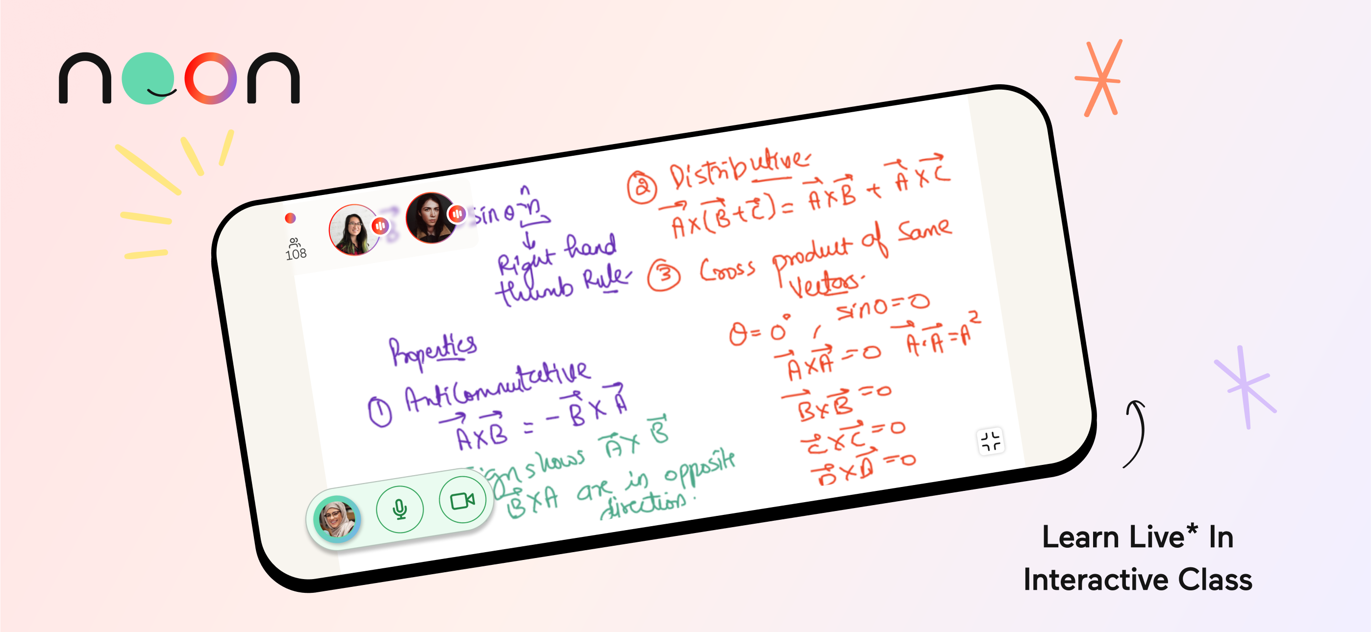
The Noon Education mobile app offers an interactive learning experience where teachers and students engage in enjoyable and high-quality academic activities.
Educational Technology
Leading a product design.
Develop on cadence, release on demand.
Aligning the user experience design aligns with business objectives.
User Journey and Wireframe, IA, Prototyping and User testing.
Design system and design accessibility.
QA and Accessibility in iOS and Android.
Launching product and team management.
Students face challenges in reaching their academic goals because of poor-quality learning experiences and limited time.
Only 8% of students are attending the full live classroom sessions, while 32% are returning to the next classroom. These obstacles can hinder their ability to fully understand complex concepts and engage meaningfully with the material, ultimately affecting their overall performance and motivation to succeed in their studies.
Product Design Challenge - Launching a new learning mobile app to transition seamlessly, engaging teachers and students across five countries: KSA, Egypt, Iraq, Pakistan, and India.

DESIGN THINKING WORKSHOP IN CHESTER, UK
Collaborating with founders and stakeholders to shape a product roadmapping & UX strategy.
We have encountered challenges due to the limitations of the first mobile app, which have hindered our ability to enhance the user experience, even with the introduction of new features. To address this, I initiated a design thinking process and generated new app design ideas to unite the team towards a common goal, aligning our business objectives with the users' pain points. As a result, the founders made a decisive choice to develop a new live classroom app.

Strategic design thinking roadmap
Our goal - to create a lively and engaging social educational classroom experience that helps students achieve their academic goals while enjoying learning and ensuring safe interactions with peers and teachers.
Understanding the business and product
We ran stakeholder workshops and stakeholder interviews to confirm the target users, understanding of business requirements. We've mapped out envisioning scenario with Personas seeing the bigger picture and why it's important to the clients to the users then we've defined:
Business Vision - We will be the leading provider of mobile education apps in our markets by seamlessly transitioning existing users through impactful product and channel strategies, driving substantial growth.
Target Audience - Both new and existing app users who aim to enhance their academic performance while achieving better test results, improving their social connections and their well-being.
Learn about users and set experience principles
Our students are located in the Middle East, where cultural norms and gender sensitivities differ. I have established experience principles.
Experience Principles
ACCESSIBLE - Journeys are straightforward, and language is sincere.
SAFE - To create a supportive environment that encourages their learning without shame.
MOTIVATED - Through small magical moments and meaningful rewards.
ENJOYABLE - Through visually stunning styles and innovative product solutions
Approach - I brought our ideas to life through rapid prototyping and iterative testing, which ensured that we are designing an impactful user experience and maximising business needs.

ui framework and taxonomy
hundreds of DESIGN FLOWS & WIREFRAME in ux/ui documentation
Onboarding without fractions.
The user can easily attend their live classroom by browsing courses and signing in.
Simplifying the complexity -
Our collaborative processes with architects, marketing, and other cross-functional teams faced challenges in designing user flows, such as registration, due to varying market demands and a lack of resources in the development team.
The new scheduling design focuses on personalised learning goals and ensures continuity in the learning process.
Students immediately joins a live classroom, allowing them to continue their learning extensively, which can motivate them to stay engaged with the app for longer.
Agenda your next learnings -
Upon selecting your learning goals, the live classroom will be activated, displaying 'Your next live classroom to join.'
Fun and playful interface design that immerses students in their learnings in the live classroom.
Students often experience boredom in the live classroom, which can be attributed to various factors such as the pacing of the lesson, the engagement level of activities, and the teaching methods
Feeling playful in the live classroom -
We introduced a new wheel interface and live chat feature, highlighting the most interactive activities for users and teaching them social skills such as engaging in discussions on the chat and raising their hands to the teacher.
Polls serve as an effective tool that engages both students and teachers in their learning experience.
Students often hesitate to ask questions out of fear of looking foolish. How can they anonymously and independently apply their academic knowledge?
Live voting results in the classroom -
It allows teachers and students to see how difficult questions are and gauge student engagement levels.
Educators now have access to resources that facilitate effective teaching practices.
Teachers can interact with students through the live teacher's main tools such as a live poll - The voting results show that teachers need to acknowledge the difficulty of the question and assess student engagement levels.
Spending in control -
Freezing a card, setting limits above which purchases cannot be made, preventing spend in the particular channel (e.g. online) and preventing spending in certain countries.

account summary view - Home Screen
User research - The lack of implementing data-driven user research could bring more cost, after all, I introduced the design research to the stakeholders to prove the user’s needs and help with prioritisation of scope that resulted in reducing the costs.
The best way to prove the interpretation of complexity was user research. We have listened to user’s pain points through qualitative and quantitive user research and prioritised feedback for the next design milestones.
I set research criteria to verify with potential solutions:
• Providing clarity and transparency around money
• Allow customers to make better decisions
• Access to hassle-free and simple money on their terms
• Affecting behavioural change – empowering customers to feel in control
• Providing a mobile-first and customer centred experience that is easy to use and aligns with customer/business expectations of the Virgin brand
Navigation system
The user just wants to get to the content with as little fuss as possible
I.e.Navigating of transaction list -
Viewing transaction monthly either by tapping the year on the top or scrolling down as it changes years simultaneously. I did prototyping in Framer. User loved this feature as it's hassle-free to navigate a long list of transaction.
Challenge with technical constraints -
The technology was not applicable to adopt this interaction-tapping year on the top of the Native app. Therefore, we compromised the decision as possible - to browse simply with scroll down without the tapping bar.
Account summary
The user can see a real-time update of changes to balance and 'payment due' reminders.
Check your balance & messages -
The relationship between the figures on this page was correctly interpreted, and we saw the terms used to describe balance become more effective throughout the rounds of research. We've tested the best copywriting and interactions -dials. That avoids misleading terms with variant tests through AB testing and shadowing 1:1 interview.
Users don’t expect breakdown of 'Balance transfer'
The user can see the new concept of viewing balance transfer.
Concerns from User feedback -
User implied misunderstanding of the relationship between these categories and the current balance.
We decided to postpone this feature to the next milestone with re-design and research.
Key selling point -
This section of the app could be a key selling point and our opportunity to actively show customers how we are helping them.

sign-in screen
Evolved Style Guide - Virgin money credit card app had no style guide when we were about to start Sprint 0, The Style Guide continued to be actively improved alongside the development sprints within the technology constraints set for the programme.
Consistent user experience
The App Style Guide is being produced in close collaboration with the Virgin Money Debit Card Team to ensure a common look and feel across Virgin Money digital channels.
The unparalleled velocity of change from proposition ideation to live production deployment in just 7 months. Used by over half a million customers transacting millions of pounds worth of controlled customer spend.

feedback from apple App Store
"Since the launch of our credit card app in February 2019 we have seen a significant increase in the number of customers choosing to use it to stay in control of their spending and borrowing. As well as viewing their balance and transactions, customers using the app have easy access to monthly statements, they can freeze their card, move money and make both regular and one-off payments to their balance. Customer interest in our online services has continually reduced, and now only a small percentage of our customer base chooses to use only our online services to manage their accounts.”
- A spokesperson said at YourMoney.com
Of course, there is negative feedback! That helps steer me back on the right path and realise the missing opportunities and gaps between the business and the customer.
DOWNLOAD APP